Page 1 of 68

Combining Uniforms, How to make a Fuku similar to this?

PostPosted: Tue May 01, 2007 10:41 am
by Spokavriel
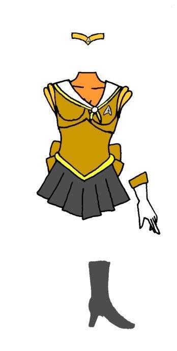
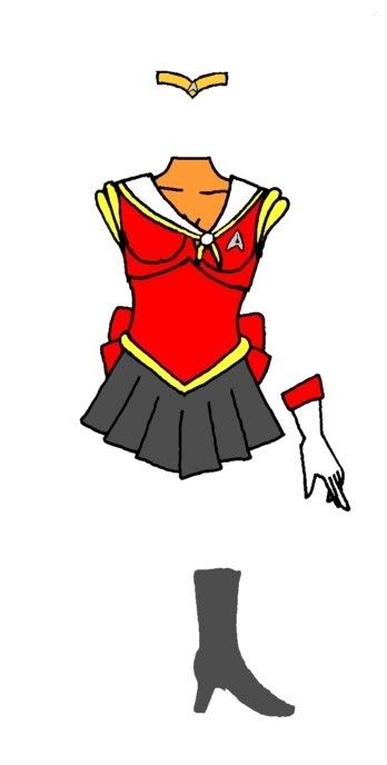
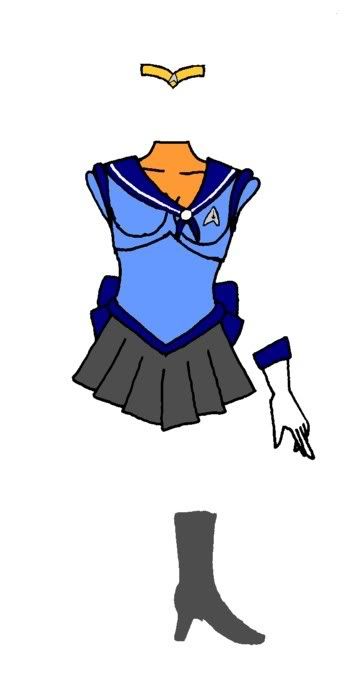
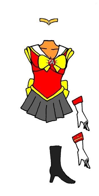
I would like some help in finding a way to have a Fuku designed that carries as many aspects (Design, color, etc.) as possible of this Starfleet Uniform. It's the closest of the 3 available in the TOS Trek manual.
Image

Although I think the Fuku skirts may be longer than Starfleet Regulations allow I mean were talking about a skirt that is only about 3 inches longer than needed to keep panties from showing when standing normally. And without extra material from pleats.

The Standard colors for Starfleet Uniforms are in this next image.
Image

Not that it has to be limited to them. But here's the entire TOS Uniform Colorcode chart I'm always fond of blues. Unfortunately the Metalics always scan darker because the scanner is designed to avoid glare.
Image

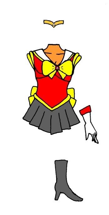
I always use the Sciences Ensignia (though my usual RP character should use Engineering but doesn't want to get killed cause that is the ensignia of TOS Red shirts) and this next Thumbnail has all 3 along with Rank stripes that could be fun to play with as well.
Image

All of these graphics are under copyright obviously I'm just glad Paramount and Batnam have never been petty enough to go after me for how often I post things they own.

I've just never tried drawing Fuku and well I'm not sure which if any elements could be kept without spoiling the look to either side. Any other Uniforms you would like to cross I wouldn't mind so long as there is help on this idea too.

PostPosted: Tue May 01, 2007 2:09 pm
by Screwball
The obvious way to make it more fuku-like would be to make the bottom half separate and replace it with a fuku skirt, and to give it a collar. Perhaps some ribbons. Can't say how good it'd look though, and if you want me to try it, well, look elsewhere. I'm rubbish at art.

For colours, Starfleet alway seems to go for the department colour and black, so you should probably keep that theme.

I will say that I hate the earlier TOS uniforms, and much prefer the ones they had during the Wrath of Khan. Those were very snazzy.

PostPosted: Tue May 01, 2007 4:12 pm
by Spokavriel
Screwball wrote:I will say that I hate the earlier TOS uniforms, and much prefer the ones they had during the Wrath of Khan. Those were very snazzy.

But they were all Maroon. (outside of protective clothing AKA engineering off duty and a few other hard to catch suits) And before that in Motion picture where you still had some color variety everyone looked like they were in their Pajamas.

I know I would like to keep the Asymetry of the Collar and the boot design even if they end up in another color. I just don't have enough experience to try to work out what would be the best mixxes.

Even taking Sailor Moon's design with the locket traded for the Sciences ensignia boots swapped and colors changed to shades of blue from the chart would be a mix. I just wonder if anyone who can draw anything like this would help find the happy medium between the full Senshi look and what's posted above.

PostPosted: Wed May 02, 2007 2:58 am
by J. St.C. Patrick
Just playing around with the theme - ( I know the badge is the command version on all of them - I did this up quickly )


Image

Image

Image

PostPosted: Wed May 02, 2007 3:48 am
by Dumbledork
Really nice work.

PostPosted: Wed May 02, 2007 9:19 am
by Spokavriel
J. St.C. Patrick wrote:Just playing around with the theme - ( I know the badge is the command version on all of them - I did this up quickly )

They look great to me 10,000x better than what I could draw at the moment. . .

I've been slowly trying to recover from a bit of a brain burnout from my participation in other online things over the past year and for some reason couldn't imagine it without sleves and kept not even being able to draw line 1. Outside of environments unless I can get it to seem at least half right in my mind first I can't get myself to draw it.

I'm half tempted to try some compositing using Trek TAS stills and your Fuku designs.

PostPosted: Wed May 02, 2007 9:52 am
by lwf58
J. St.C. Patrick wrote:Just playing around with the theme


You are missing the big bow on the front. Suggest having one at the bottom of the asymetrical v-collar, with the ship's badge in the center of the bow. Perhaps on top of a jewel?

PostPosted: Wed May 02, 2007 10:24 am
by J. St.C. Patrick
Like this?

Image

PostPosted: Wed May 02, 2007 11:02 am
by lwf58
Yep. Just need to decide if the ship's badge looks better on a jewel, or by itself.

PostPosted: Wed May 02, 2007 11:22 am
by Spokavriel
lwf58 wrote:Yep. Just need to decide if the ship's badge looks better on a jewel, or by itself.

How about making the Badge be similar to the Lunar locket but with Jewel inlay instead of just black lines for the symbols?

Gems would probably be Saphire Ruby and Topaz for color similarities.

PostPosted: Wed May 02, 2007 2:04 pm
by Togashi Gaijin
lwf58 wrote:Yep. Just need to decide if the ship's badge looks better on a jewel, or by itself.

The badge shape would stand out better as a replacement for the usual senshi gem, allowing for a quicker "visual ID" of the fuku.

PostPosted: Wed May 02, 2007 2:11 pm
by Togashi Gaijin
Another thing you can think about is to use the border on the collar as the place to put any "rank stripes" (the normal senshi fukus already sport a varying number of border stripes).

PostPosted: Wed May 02, 2007 2:13 pm
by lwf58
Togashi Gaijin wrote:Another thing you can think about is to use the border on the collar as the place to put any "rank stripes" (the normal senshi fukus already sport a varying number of border stripes).


That sounds interesting. And you can put them on the cuffs of the gloves, of course.

Looking at the badge on the jewel, it's too small. Two ways around that might be to just use the badge by itself, or to have a larger jewel with the badge being the same diameter. In other words, the insignia with a circle around it touching the top and bottom points.

PostPosted: Wed May 02, 2007 2:41 pm
by Spokavriel
lwf58 wrote:That sounds interesting. And you can put them on the cuffs of the gloves, of course.

Looking at the badge on the jewel, it's too small. Two ways around that might be to just use the badge by itself, or to have a larger jewel with the badge being the same diameter. In other words, the insignia with a circle around it touching the top and bottom points.

How about taking a Next Gen Twist. You know how the Com badges have the Gold Oval behind them. Swap the Gold out with the Jewel and keep the gem area at least 1/3 the total hight of the bow. That way it won't seem like it's been over tightened.

About the Rank Stripes it would probably fit best to have them on the cuffs of the gloves afterall that is almost the same position they would have been in if the sleves were still there. Adding together info from the Tech Manual they are usually in the space starting 11 centimeters back from the wrist and extend as far as 20.1cm away from the wrist for the higher ranks. (gap from wrist to sleve end shown in the Duty Uniform image (5.1cm) + the distances shown on sleves with the rank stripe description)

PostPosted: Wed May 02, 2007 4:53 pm
by J. St.C. Patrick
Increased jewel size and tried rank insignia on gloves.
Changed badge symbol to engineering.

Image

Senshi gloves range from very short - as here to full elbow length.
So there is plenty of room to play with for positioning the sleeve rank stripes.