Shading experiment

Request, Submission, or Review of Fanart. Again "fukufic" content preferred but not necessary

Shading experiment

Postby mondu_the_fat » Sat Feb 23, 2008 12:16 am

(I'd post this in in deviantart or other similar sites, but I'm wary of running into the "CG isn't art/Poser isn't 3D/real artists use Maya/Draw from real life/you won't get better if you make anime/fanart sucks" crowd rather than actual helpful comments; I get the most amount of help from here than there)

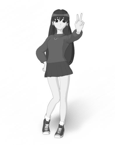
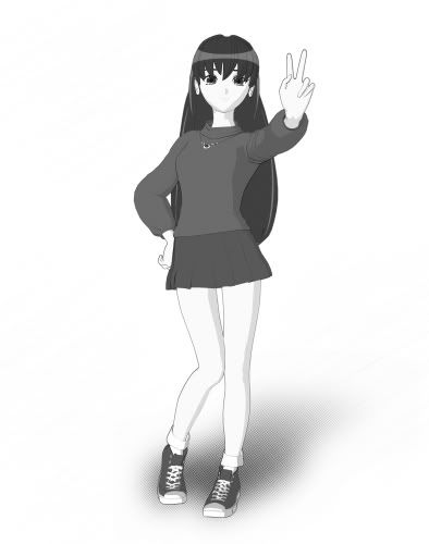
shading/toning experiment (would appreciate comments on #2 and #3):

Image

1 -- starting point; default sketch output of Poser (included here just to show a starting point)

4 -- default output had I just used the render engine

2 -- I've always wanted to get an "manga look", but can't afford commercial digital tones/programs (and the free ones are for photoshop, which I don't have), so I tried making my own screen tones. The shading from (1) was altered and erased and replaced with my own tones.

3 -- an experiment in manual shading (by taking (2) and applying the approriate colors)
"So Igor wasn't kidding. Most people just ensure they won't die cold and alone by making friends...I gain superpowers and have mysterious voices tell me I did a good job. My life is a goddamn mess."
-- Minato Arisato, My Life is a Goddamn Mess
mondu_the_fat
User avatar
Asteroid Senshi
Posts: 919
 

Postby Atlan » Sat Feb 23, 2008 12:38 am

Although (4) is obviously the most developed, I really like (3).

It could probably do with a little transperancy on the hair where it hangs over the face, but other than that I really like it. How did you do it? Just by flood-filling the right regions?
The Banana, the Atheist's Nightmare:

God made it with a non-slip surface, a color coded system so we know when to eat it, and an easy open tab at the top of the banana. It's just the right shape for a mouth and is easy to digest!!
Atlan
User avatar
Asteroid Senshi
Posts: 924
 

Postby mondu_the_fat » Sat Feb 23, 2008 1:17 am

What I did was put each item (hair, skin, shirt, shoes, tonfa, pants) into a seperate files. Then I adjusted the colors of each file.

For example, I took the hair in 2 and put it on another file. Then I remove a lot of blue from the entire thing and some of the green so that it looks a bit orange-y. Then I pasted the now orange hair to the old picture.

The technique is similar to this:

http://abuze.deviantart.com/art/Tutoria ... t-25721834

except I started off with a b/w picture.
"So Igor wasn't kidding. Most people just ensure they won't die cold and alone by making friends...I gain superpowers and have mysterious voices tell me I did a good job. My life is a goddamn mess."
-- Minato Arisato, My Life is a Goddamn Mess
mondu_the_fat
User avatar
Asteroid Senshi
Posts: 919
 

Postby Atlan » Sat Feb 23, 2008 1:33 am

Looking at it again, there's something funnt about 3's arm. Not the one with the stick, the one held in front of her. Between the shoulder and the elbow looks... flat, I guess.

What I did was put each item (hair, skin, shirt, shoes, tonfa, pants) into a seperate files. Then I adjusted the colors of each file.


Well it looks awesome. Probably my favourite peice of yours to date.
The Banana, the Atheist's Nightmare:

God made it with a non-slip surface, a color coded system so we know when to eat it, and an easy open tab at the top of the banana. It's just the right shape for a mouth and is easy to digest!!
Atlan
User avatar
Asteroid Senshi
Posts: 924
 

Postby Sunshine Temple » Sat Feb 23, 2008 1:38 pm

2 Is a pretty good manga style. Shading looks good and seems to be from a coherent light source.

3 Is a nice simulation of the cell shading, I like it better than 4. It looks less "computery" To be fair anime is computer colored and animated these days.

I think it's a cool experiment. Very neet.
Sunshine Temple
User avatar
Site Mistress
Posts: 2136
 

Postby Spokavriel » Sat Feb 23, 2008 2:53 pm

Image

I did a similar color shift on this image but I didn't part it out. I ended up just flooding the areas that weren't textured using colors that I thought fit. I really like #2 best in the example though.

Edit: I never cleaned it up more because you can see in my signature what I was using it for.
Image
Spamville Character ProfileArchived Current Senshi of Ophelia (Uranus VII).
My Console Video Games
Spokavriel
User avatar
Eternal Power Senshi
Posts: 47773
 

Postby lwf58 » Sun Feb 24, 2008 9:39 am

Is the left arm being held against the chest? It isn't casting a shadow on the chest. Or are you not using shadows in this at all?

On the whole, 2 and 3 are the most accurate. 4 has much too heavy shading, and the shading is too wide in several places.

The head needs a lot of work. There is very little shading in 2 and 3, and it's noticeable in the ear and hair. More specifically, the ponytail and bangs don't look quite right, and the ear has no texture at all.

The area around the collarbone is too sharply defined. That's one area where 4 is much better. 4 is also much better in regards to the wrinkles in the clothing and definition of the breasts. Where it falls short is the torso is the top darkening below the breasts; that's inaccurate.

2 is better than 3 in the shading of the legs. 3 looks too flat. The boots are better in 4 than 2 or 3.

Overall, the lighter coloration in 3 is better than 4. 3 just lacks a lot of important detail.
lwf58
User avatar
Site Master
Posts: 2201
 

Postby mondu_the_fat » Sun Feb 24, 2008 10:34 am

Spokavriel wrote: I did a similar color shift on this image but I didn't part it out. I ended up just flooding the areas that weren't textured using colors that I thought fit. I really like #2 best in the example though.


As much as I'd like not to part the picture (would save time), I have to in order to get several parts right. That Ranma catgirl for instance, has yellow highlights in her hair.

Where it falls short is the torso is the top darkening below the breasts


What do you mean?

Is the left arm being held against the chest? It isn't casting a shadow on the chest. Or are you not using shadows in this at all?


I'm omitting shadows for the time being.
"So Igor wasn't kidding. Most people just ensure they won't die cold and alone by making friends...I gain superpowers and have mysterious voices tell me I did a good job. My life is a goddamn mess."
-- Minato Arisato, My Life is a Goddamn Mess
mondu_the_fat
User avatar
Asteroid Senshi
Posts: 919
 

Postby lwf58 » Sun Feb 24, 2008 1:05 pm

mondu_the_fat wrote:What do you mean?


In image 4, the shoulders and sleeves are white, the chest is light gray, and the rib area darkens as it goes down. Clothing doesn't do that, and there is nothing in about the figure that would account for it as shading. She's wearing a white top; it should be white all the way down, except for the shading and textures.

I just noticed that her waist and the top don't line up right where they meet. It's skintight everywhere else, and the difference on her right side is too great even assuming that the bottom is bunched up.
lwf58
User avatar
Site Master
Posts: 2201
 

Postby mondu_the_fat » Sun Feb 24, 2008 6:53 pm

lwf58 wrote:In image 4, the shoulders and sleeves are white, the chest is light gray, and the rib area darkens as it goes down. Clothing doesn't do that, and there is nothing in about the figure that would account for it as shading. She's wearing a white top; it should be white all the way down, except for the shading and textures.


Ah, that was deliberate. I was trying to learn how to apply toning gradients to clothing, something I've seen in many manga. However, it didn't come off well in that picture, as it seems to do better when applied to relatively flat clothes, mono-tone, and backgrounds that imply a light source rather than a blank one (like this one, or the gundam pics in the other thread).

I just noticed that her waist and the top don't line up right where they meet. It's skintight everywhere else, and the difference on her right side is too great even assuming that the bottom is bunched up.


Yeah, her rear bunches out too much.
"So Igor wasn't kidding. Most people just ensure they won't die cold and alone by making friends...I gain superpowers and have mysterious voices tell me I did a good job. My life is a goddamn mess."
-- Minato Arisato, My Life is a Goddamn Mess
mondu_the_fat
User avatar
Asteroid Senshi
Posts: 919
 

Postby mondu_the_fat » Sat Mar 08, 2008 5:11 am

More shading experiments. Unfortunately, when I tried to color this it became truly fugly, but otherwise I think I'm starting to get the hang of it. I've always had a problem with hair highlights, so I tried to copy Lucky Star.

Image
"So Igor wasn't kidding. Most people just ensure they won't die cold and alone by making friends...I gain superpowers and have mysterious voices tell me I did a good job. My life is a goddamn mess."
-- Minato Arisato, My Life is a Goddamn Mess
mondu_the_fat
User avatar
Asteroid Senshi
Posts: 919
 

Postby lwf58 » Sat Mar 08, 2008 9:32 am

No major comments on that one other than the hair. You got the top of the head looking good, but the part behind her back is awful. No texture at all. Looks like a plastic board.
lwf58
User avatar
Site Master
Posts: 2201
 

Postby mondu_the_fat » Sat Mar 08, 2008 8:54 pm

You're right. How's this look ?(also edited the neck, jaw, and shadows)

Image
"So Igor wasn't kidding. Most people just ensure they won't die cold and alone by making friends...I gain superpowers and have mysterious voices tell me I did a good job. My life is a goddamn mess."
-- Minato Arisato, My Life is a Goddamn Mess
mondu_the_fat
User avatar
Asteroid Senshi
Posts: 919
 

Postby lwf58 » Sat Mar 08, 2008 9:55 pm

Hair: still not good. More specifically, you've got lines in the bangs to delineate locks of hair, but nothing in the body of hair falling behind her back to do the same. That's why it looks monolithic. Some shading and highlighting would also add depth to the hair. The highlights to either side of her ears add definition in that area, but they don't fit quite right into the hair style- it looks like you couldn't quite decide on long or short hair. Those highlights need to flow into the way her hair falls past her shoulders.

Jawline shading is a bit too much. It's almost a straight diagonal line, instead of following the contour of the jaw. Neck shading goes just a little too far into the center of the neck, IMHO. There should be a hint of shadow just under the center of the jawline on the neck, and then down the left side of the neck, shaped sort of like the number 7.
lwf58
User avatar
Site Master
Posts: 2201
 

Postby mondu_the_fat » Sat Mar 08, 2008 11:30 pm

Like that?

Image
"So Igor wasn't kidding. Most people just ensure they won't die cold and alone by making friends...I gain superpowers and have mysterious voices tell me I did a good job. My life is a goddamn mess."
-- Minato Arisato, My Life is a Goddamn Mess
mondu_the_fat
User avatar
Asteroid Senshi
Posts: 919
 

Next

Return to Fan Art

Who is online

Users browsing this forum: No registered users